1. Introduction
Hydrological models are widely used for research, engineering and water resources management. Whatever the context, modelers often share common interests in quantifying the efficiency, the robustness and the realism of models structures, improving the generality and transposability of model structures across space and time scales, and designing methods to extract information from hydrological time series for model parameter identification.
A wide panel of methodologies and numerical techniques currently exist to meet these objectives. But advanced model validation remains a key issue for model users, who apply models to make decisions. The balance between the predictive power and the physical realism of models is still a matter of debate in validation approaches (see for example the debate between Konikow and Bredehoeft [1992] and de Marsily [1994], as summarized by Andréassian [2023], this issue). In the context of growing data availability [Addor et al. 2020], the efficiency and generality of models can be better assessed by using large watershed samples [Gupta et al. 2014], typically consisting of several hundreds to a few thousands of watersheds [Newman et al. 2015, McMillan et al. 2016, Lane et al. 2019, Mathevet et al. 2020]. The use of large watershed samples has various benefits, among which are improved understanding based on rigorous and controlled numerical experiments allowing comparison and hypothesis testing, and improved robustness of generalization based on statistical analyses of model performance and reduced sensitivity to site-specific watershed properties.
Among the efficiency criteria commonly used to quantify the adequacy between simulations and observations, the Nash–Sutcliffe efficiency [Nash and Sutcliffe 1970; NSE] and the Kling–Gupta efficiency [Gupta et al. 2009; KGE] provide summary statistics that can be calculated on long periods or sub-periods [Mathevet et al. 2020]. These metrics are often applied to model simulations considering as target variables: (i) streamflow (Q), (ii) various non-linear transformations of streamflow [square root, inverse, logarithmic or Box–Cox transformations; see Santos et al. 2018] and (iii) some hydrological signatures (hydrological regime, flood distribution, drought distribution, etc.). Some major drawbacks of the NSE have long been demonstrated: the use of a poor benchmark model to assess model performances [Schaefli and Gupta 2007], an unbounded formulation inappropriate for statistical analyses [Mathevet et al. 2006] or an unpredictable trade-off between mean bias, variability bias and correlation while calibration [Gupta et al. 2009]. The KGE has been proposed to overcome some of these problems, providing a more balanced compromise between expected properties of model simulations (bias on mean flow, bias on flow variability and correlation between simulation and observation).
When working with large watershed samples, it becomes necessary to summarize the sets of efficiency criteria values to enable effective comparison of performance obtained with different model structures, time periods or calibration options, etc. Distributions, boxplots and scatterplots are often used to visually compare numerical experiments. However, while such analyses are statistically relevant, they can drastically reduce the information content of a numerical experiment, particularly when some criteria are partially correlated. Alternatively, one may consider the Taylor diagram [Taylor 2001], which is commonly used to simultaneously visualize several error components of a model simulation, and which has been used in climate and hydrological modeling studies. Taylor diagram is usually used in its classical formulation to compare few models or few data sets on a case study, considering correlation, standard deviation and root mean square error (RMSE) [Yaseen et al. 2018, Maroufpoor et al. 2020].
The objective of this paper is to propose a modification of Taylor diagram to simultaneously represent components of the KGE, i.e. mean bias, variability bias and correlation. We illustrate the application of this graphical tool using results of a numerical experiment based on the methodology proposed by Mathevet et al. [2020] and demonstrate its usefulness to answer the following research questions:
- What are the main performances of models calibrated using NSE or KGE as objective function (in terms of mean bias, standard deviation bias and correlation and dependency structure between these criteria)?
- Do the performances vary with model structure or watershed location?
- What are the impacts of non-linear transformations of streamflow, classically used when calibrating rainfall-runoff models?
Section 2 presents the theoretical background of Taylor diagram and its modification, Section 3 presents an overview of the experimental design, and Section 4 details the general results of the study. Section 5 presents a discussion of the results and our conclusions are given in Section 6.
2. Theoretical background
2.1. Classical Taylor diagram
This section reviews the basics underlying the construction of a Taylor diagram. Table 1 lists the symbols used throughout this paper.
List of symbols used
| Symbol | Meaning | Mathematical definition |
|---|---|---|
| 𝜇0 | Mean of observed streamflow | |
| Mean of simulated streamflow | ||
| 𝜎0 | Standard deviation of observed streamflow | |
| Standard deviation of simulated streamflow | ||
| 𝛽 | Absolute mean bias | |
| 𝛽n | Normalized mean bias | |
| 𝛽r | Relative mean bias | |
| 𝛼 | Relative variability bias | |
| E | Root mean square error (RMSE) | |
| E′ | RMSE on centered patterns (CRMSE) | E′2 = E2 −𝛽2 |
| 𝜌 | Radius (distance to origin) in the polar plane | |
| 𝜃 | Azimut (counter-clockwise from x-axis) | |
| R | Pearson correlation coefficient | |
| fi | Observations of a given variable (streamflow in our case) | |
| Estimations of a given variable |
A Taylor diagram [Taylor 2001] is intended to simultaneously display several metrics on a graph, describing the discrepancies between a test field or series (e.g., the simulation) and a reference one (e.g., the observation). These metrics consist of the (sample) Pearson correlation coefficient R, the standard deviation of the simulation (resp. the ratio of simulated to observed standard deviation ), and E′ the root mean squared error on centered patterns (CRMSE). The CRMSE differs from E, the classical RMSE, in the removal of the bias component, according to the relation:
| (1) |
| (2) |
| (3) |
| (4) |
| (5) |
| (6) |
| (7) |
| (8) |
2.2. Adapting Taylor diagram to represent bias, NSE, total RMSE, or any monotonic function of sum of squared errors (SSE)
One limitation of the previous diagram is that it does not allow for visualizing the absolute bias along with the CRMSE, and not the bias component (resp. ). Though it is rarely used in the literature, Taylor proposed a method to display bias on the same frame. It consists of attaching a segment to the point, which length is equal to |𝛽| (resp. |𝛽n| in the normalized version), as shown in Figure 1.
Convention for representing bias and total RMSE. Green circles centered on the reference are contours of CRMSE if used with the dot P, or RMSE if used with the end tip of the green arrow (P′). In this case where 𝜎0 = 1 for the sake of simplicity, estimated standard deviation is , correlation R = 0.86, CRMSE E′ = 0.75, bias 𝛽 = ±0.45 and RMSE E = 0.87.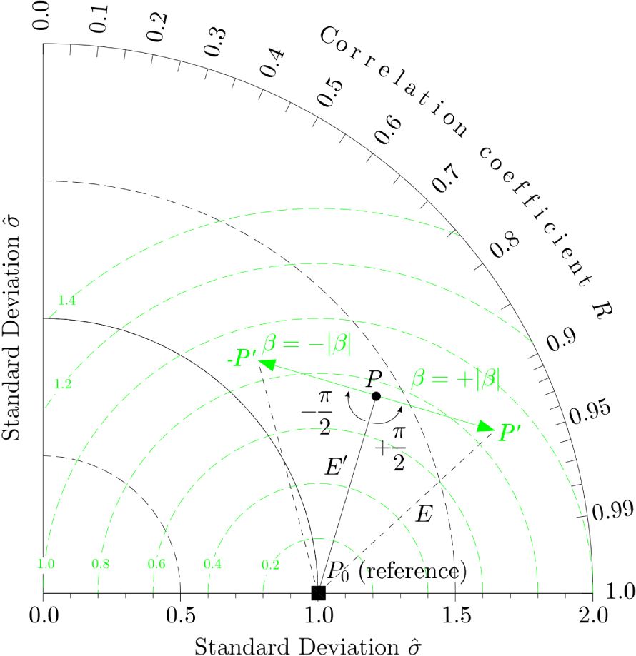
If the segment is oriented perpendicular to the direction (P0 P), then the squared hypotenuse P0 P′2 of the right triangle created in this way satisfies the condition:
| (9) |
| (10) |
| (11) |
| (12) |
| (13) |
Recognizing that NSE, MSE, RMSE are all monotonic functions of the total sum of squared errors, it is then easy to modify the diagram in order to display curves that are, for example, contour lines of NSE efficiency or its bounded version [Mathevet et al. 2006] rather than contour lines of (C)RMSE. In this section, we show that any monotonic function of SSE can be drawn on the normalized version of the Taylor diagram. This provides an interesting outlook of a hydrological simulation through the visualization of five assessment criteria for all the watersheds: correlation R, ratio of simulated to observed standard deviation, normalized bias 𝛽n, NSE on centered patterns (CNSE) and classical NSE.
2.3. Prone-like regions in the modified Taylor diagram depending on the objective function
We now wish to determine in which region of the Taylor diagram a simulation result should fall, when the hydrological model is calibrated with an ordinary-least-squares (OLS) criterion such as the Nash–Sutcliffe efficiency.
For this, we use the decomposition of NSE proposed by Gupta et al. [2009], which reads:
| (14) |
| (15) |
| (16) |
| (17) |
| (18) |
Let us consider the normalized version of the Taylor diagram, and let 𝜀OLS be the locus of the points satisfying the condition 𝛼 = R i.e. 𝜃 = arccos(R) = arccos(𝛼). The cartesian coordinates of those points hence verify:
| (19) |
| (20) |
| (21) |
| (22) |
| (23) |
Construction of the locus of the points satisfying ∂NSE∕∂𝛼 = 0 or, synonymously, 𝛼 = R in red. The green circles are contours of NSE.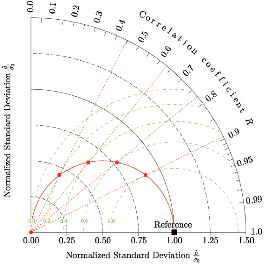
3. Experimental design
Here we use the same numerical experiment as in Mathevet et al. [2020], which is briefly summarized in this section.
3.1. Watershed sample
A large sample of 2050 watersheds spanning over eight countries is used in this paper. This sample is mainly (80%) represented by watersheds in France, USA and Australia. Other watersheds are situated in Italy, Laos, Sweden, Switzerland and UK. This sample covers a variety of climatological, physical and hydrological characteristics (see Table 2). Time series consisted of mean daily rainfall, air temperature and streamflow. Climatic data are averages at the watershed scale, but the way these averages were computed is variable between the national sub-samples of watersheds. Potential evapotranspiration (PE) was computed using the temperature-based formula proposed by Oudin et al. [2005].
Distributions of characteristics of the 2050-watershed sample
| Distribution percentiles | |||||
|---|---|---|---|---|---|
| Characteristics | 0.05 | 0.25 | 0.50 | 0.75 | 0.95 |
| Watershed area (km2) | 31 | 102 | 255 | 734 | 2785 |
| Mean annual total precipitation (P) (mm/yr) | 626 | 800 | 950 | 1175 | 1627 |
| Part of precipitation falling as snow (-) | 0 | 0 | 0.03 | 0.09 | 0.29 |
| Mean annual air temperature (°C) | 4.9 | 9.2 | 10.5 | 12.1 | 16.2 |
| Mean annual potential evapotranspiration (PE) (mm/yr) | 471 | 633 | 686 | 773 | 998 |
| Mean annual runoff (Q) (mm/yr) | 53 | 207 | 344 | 541 | 1111 |
| Aridity index (P/PE) (-) | 0.80 | 1.12 | 1.35 | 1.74 | 2.82 |
| Runoff coefficient (Q/P) (-) | 0.08 | 0.24 | 0.36 | 0.48 | 0.79 |
| Available time series length (yr) | 11 | 18 | 33 | 36 | 55 |
3.2. Hydrological models
Two conceptual rainfall-runoff models are used in this study: the GRX model [slightly modified from GR4J model, Le Moine 2008 and Pushpalatha et al. 2011] and the MRX model [modified from MORDOR model, Garçon 1996 and Garavaglia et al. 2017]. These two models have already been intensively tested, both for research and operational applications, in France and worldwide [Mathevet et al. 2020]. A number of studies have shown that their structures can be efficient, with comparable performance in simulation, forecast and extrapolation modes. A snow accumulation and melt routine [from Garavaglia et al. 2017] is also used in this study to represent snow processes of mountainous watersheds. Note that these two models differ in their level of complexity with 9 free parameters for GRX and 22 free parameters for MRX.
3.3. Calibration and evaluation metrics
Two classical metrics were used:
| (24) |
NSE and KGE metrics were used for model calibration. NSE, KGE, 𝛽r, 𝛼 and R were used for model evaluation. On a limited sub-sample of 635 watersheds (30% of the whole sample, to reduce computing time), a square root transformation of streamflow time-series was used to compute NSE and KGE metrics for model calibration.
3.4. Testing procedure
A classical split sample test (SST) procedure was implemented [Klemeš 1986]. For each watershed, the available time period was divided into two independent sub-periods of equivalent length. After a one-year warm-up period to minimize state initialization errors, calibration was performed on each sub-period (first half, then second half), followed by evaluation on the other sub-period (second half, then first half). On the 2050 watershed sample, the mean temporal length of calibration and evaluation periods is 14 years. This testing procedure provided 4100 calibration and evaluation periods to assess model performance. Parameter optimization was conducted by use of a genetic algorithm [Mathevet 2005].
4. Results
4.1. Mono-objective performance assessment using distribution or boxplot analyses
When using a large sample of watersheds, it is difficult to focus on local performance of a given model on a particular watershed, but much easier to draw general conclusions regarding comparative model performance under the hypotheses of the numeric experiments studied. Classically, samples of performance metrics are analyzed using empirical cumulative distributions (Figure 3) and distributions are summarized by boxplots (Figure 4).
Comparison of GRX and MRX KGE performance in calibration and evaluation using (a) NSE(Q) or (b) KGE(Q) as objective function to optimize model parameters.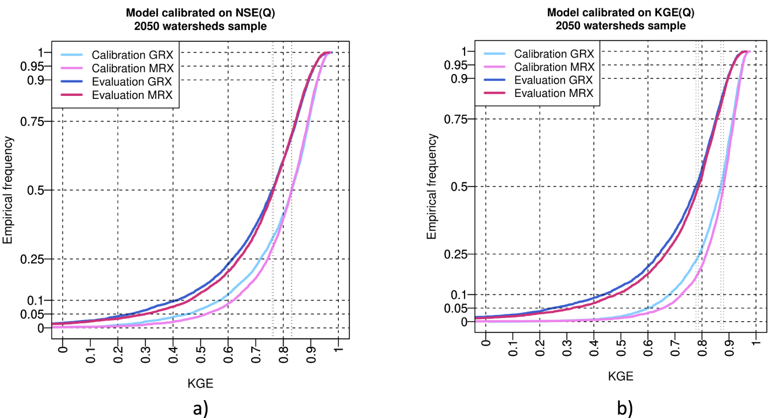
Comparison of GRX and MRX multiobjective performance (mean bias, variability bias, correlation, KGE and NSE) in calibration and evaluation using (a) NSE(Q) or (b) KGE(Q) as objective function to optimize model parameters. Boxplots represent the 5, 10, 25, 50, 75, 90 and 95 quantiles.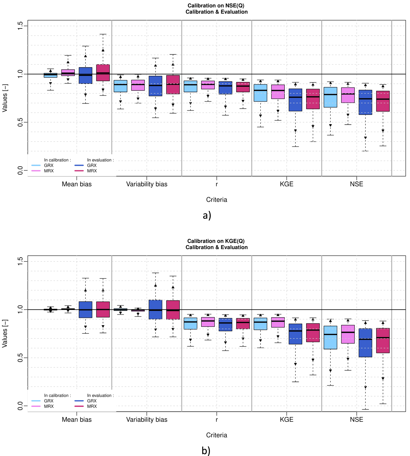
Figure 3 shows the full distribution for the KGE(Q) performance metric only (for sake of brevity), while models are calibrated with NSE(Q) (Figure 3a) and KGE(Q) (Figure 3b). This figure shows that models have a similar distribution of KGE(Q) (particularly above median value) in calibration and evaluation, that models have a similar reduction of performance from calibration to evaluation and obviously that models calibrated with KGE(Q) have better performances than models calibrated with NSE(Q), while evaluated with KGE(Q).
Figure 4 shows the sample distributions of performance metrics (𝛽r, 𝛼, R, KGE and NSE) for the calibration and evaluation periods (i.e. 4100 values per period), for each of the two models calibrated either with NSE(Q) or KGE(Q) as objective function (a detailed analysis of this numerical experiment is presented in Mathevet et al. [2020]).
When using NSE(Q) as objective function, Figure 4a shows that models are not biased in terms of mean calibration. During evaluation, models could be biased in mean but they remain not biased on average (instead the spread of the distribution increases). In terms of variability bias, Figure 4a shows that models are biased on average (mean underestimation of variability by 10%) and that the spread of the variability bias distribution increases from calibration to evaluation [Gupta et al. 2009].
When using KGE(Q) as objective function, Figure 4b shows that models are not biased in terms of mean and variability during calibration. During evaluation, models could be biased in mean and variability, but they remain not biased on average (the spread of the distribution increases).
Figure 4 also shows that both models have a median correlation around 0.9 and that distributions are pretty similar for the two models and from calibration to evaluation. This means that the watershed dynamics are rather equally well represented by both models, whatever the objective function used for optimization.
KGE(Q) and NSE(Q) distributions partially filter out some important features of individual mean and variability bias distributions and correlation distribution. While calibrated with KGE(Q), the KGE(Q) distribution is very similar to the correlation distribution since models are not biased in terms of mean and variability. From calibration to evaluation, both KGE(Q) and NSE(Q) distributions show a general decrease due to the average decline of performance concerning the representation of streamflow mean and variability.
4.2. Multi-objective performance assessment using Taylor diagram
In the following part of the paper, only GRX results will be presented, since the MRX results have similar patterns and lead to similar conclusions. MRX results are presented in Appendix A.
Distributions or boxplots are useful graphical tools for the statistical analysis of model performance for a given metric. However as stated earlier (Section 2), some performance metrics might be correlated while calibrated with a given objective function (NSE(Q) as an example, or any OLS criterion).
Figure 5a shows the GRX model results when calibrated with NSE(Q) as objective function. This figure confirms that the theoretical behavior described earlier by Gupta et al. [2009] actually occurs when calibrating the model with the NSE(Q) criterion. In the calibration phase, hydrological models manage to get a quite small mean bias, since red arrows are barely distinguished in the left-hand side diagram of Figure 5a, given that they are very short. Mean bias in calibration is becoming greater for watersheds where models obviously fail to correctly simulate streamflow. It is generally the case of very arid watersheds, where models are less robust, with lower correlation and higher standard deviation bias [Mathevet et al. 2020]. RMSE and CRMSE being very close for most of the watersheds, the colored dots characterizing the centered patterns clearly align along the blue semi-circle in the (R, 𝛼) space, where the condition is satisfied. Two-dimensional contour plots show that 90% of the population lies between R ∈ [0.6,0.98] and 𝛼 ∈ [0.5,1.02].
Taylor diagram representing variability bias and correlation (points), and mean bias (arrows in red) for (a) GRX model in calibration (left) and evaluation (right) while calibrated with NSE(Q) as objective function, and (b) GRX model in calibration (left) and evaluation (right), when calibrated with KGE(Q) as objective function. Contour plot illustrate the two-dimensional density of points (from 10% to 90% of the sample).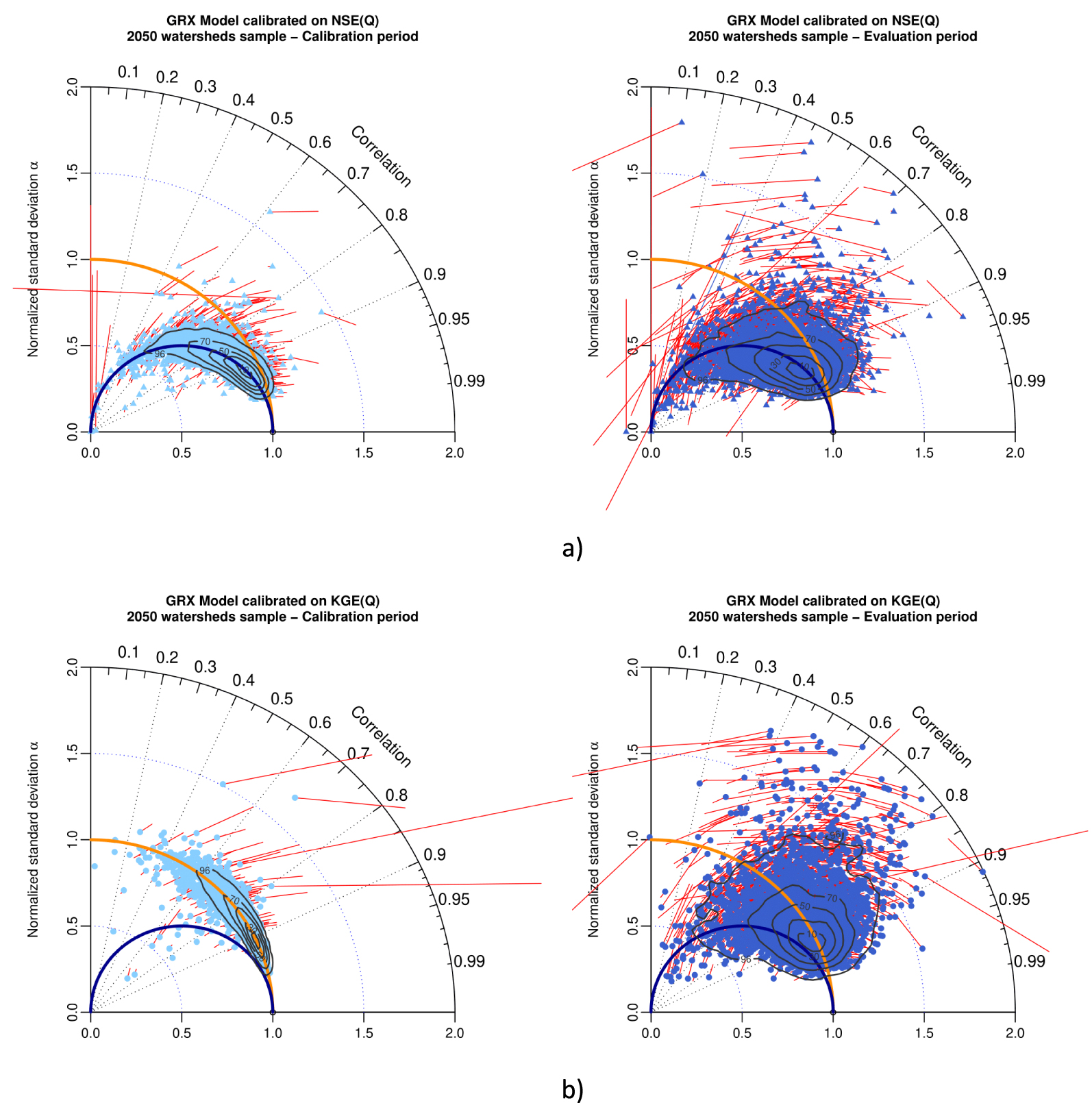
In the evaluation period (right-hand-side diagram of Figure 5a), the underestimation of flow variance obviously persists since colored points are still centered around the red semi-circle, though with much more scatter, and bias substantially increases. Two-dimensional contour plots show that 90% of the population lies between R ∈ [0.55,0.97] and 𝛼 ∈ [0.4,1.2].
Figure 5b shows the results of GRX model calibrated with KGE(Q) as objective function. In the calibration period (left-hand-side diagram of Figure 5b), GRX manages to get a small mean bias (red arrows are barely distinguished in the left-hand side diagram of Figure 5b, since they are very short), apart for some particular watersheds (again very arid watersheds). While calibrated with KGE(Q), the centered pattern clearly aligns with the unbiased normalized standard deviation semi-circle (in red) with a very limited 2D scatter (90% of the population lies between R ∈ [0.6,0.98] and 𝛼 ∈ [0.95,1.05]. In the evaluation period (right-hand-side diagram of Figure 5b), GRX has a limited normalized standard deviation bias since colored points are still centered around the red semi-circle in the (R, 𝛼) space, though with much more scatter and bias substantially increases. Two-dimensional contour plots show that 90% of the population lies between R ∈ [0.6,0.98] and 𝛼 ∈ [0.5,1.5].
Figures 6 and 7 present results for NSE(Q) and KGE(Q) as objective functions, for the GRX model and three climate clusters as defined in Mathevet et al. [2020]: (a) arid with desert and steppe (A), (b) temperate with warm summer (T + WS), and (c) temperate without dry season and warm summer (T − DS + WS). These figures show that the conclusions obtained with the full 2050 watershed sample are still valid with limited climate clusters (from 100 to 800 watersheds) and patterns of results in the modified Taylor diagram are mostly the same. The large variability of model performance of arid watersheds is illustrated in Figures 6a and 7a, while the homogeneity of model performance for temperate without dry season watersheds is illustrated on Figures 6c and 7c.
Taylor diagram representing variability bias and correlation (points) and mean bias (red arrows) for GRX model in calibration (left) and evaluation (right) for (a) arid with desert and steppe cluster (586 watersheds), (b) temperate with warm summer cluster (785 watersheds), and (c) temperate without dry season and warm summer (125 watersheds), when calibrated with NSE(Q) as objective function. Contour plots illustrate the two-dimensional density of points (from 10% to 90% of the sample).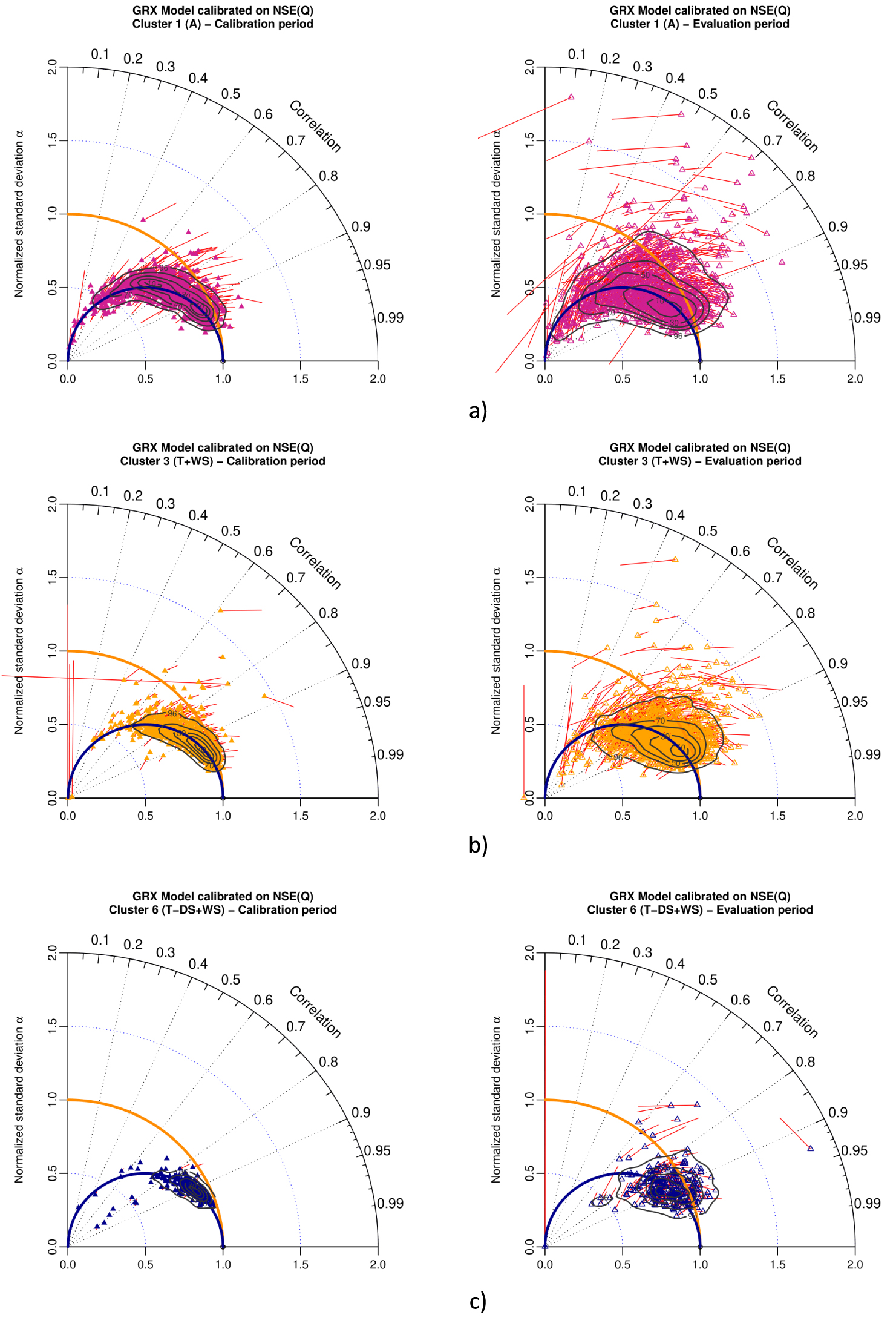
Taylor diagram representing variability bias and correlation (points) and mean bias (red arrows) for GRX model in calibration (left) and evaluation (right) for (a) arid with desert and steppe cluster (586 watersheds), (b) temperate with warm summer cluster (785 watersheds) and (c) temperate without dry season and warm summer (125 watersheds), when calibrated with KGE(Q) as objective function. Contour plots illustrate the two-dimensional density of points (from 10% to 90% of the sample).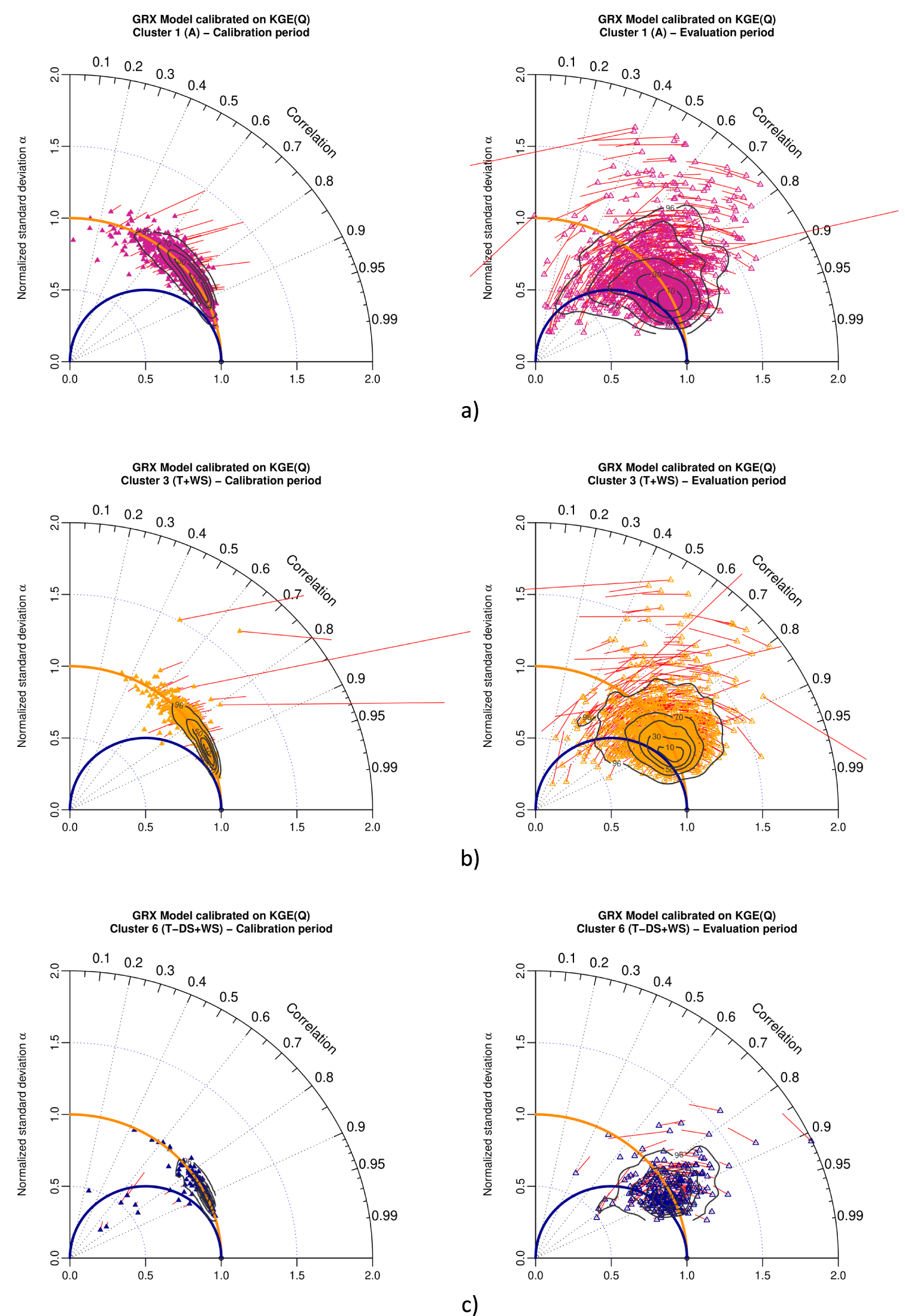
As previously shown in Figures 3 and 4, while calibrated with NSE(Q) or KGE(Q), both models have a very similar behavior and level of performances in calibration and evaluation. This is shown by the similar pattern of the 2D density contour plot on Figure 5 (resp. Appendix A, Figure A1), independently from climate clusters as shown on Figures 6 and 7 (resp. Appendix A, Figures A2, A3). The comparison of model behavior clearly shows the significant impact of the choice of the objective function (NSE(Q) or KGE(Q)), whatever the hydrological model (GRX or MRX, with very different level of complexity) and whatever watershed properties (large sample of 2050 watersheds worldwide). As stated previously [Gupta et al. 2009, Mathevet et al. 2020, among others], KGE(Q) leads to much more reliable performance than NSE(Q).
Furthermore, the Taylor diagram represents a complementary tool to distributions (Figure 3) or boxplots (Figure 4), allowing a multi-objective representation of model performance behavior on a large sample of watersheds (which is always difficult to summarize) or climate clusters. Taylor diagram (Figures 5–7) allow to display dependency structure between correlation and viariability bias while calibrated with NSE(Q).
A complementary use of Taylor diagram is to explore the sub-period variability of performances of a model on a given case study, in comparison to performances estimated over the whole period. As previously explored by Mathevet et al. [2020], sub-period variability of performances could be high, with unbiased simulation in mean and variability at the full period scale, but with a totally different behavior at a sub-period scale. Figure 8 show the full period and sub-period (annual basis) performances for GRX model calibrated with KGE(Q) as objective function for Hérault (Y2102010), Glueyre (V4145210) and Blavet (J5202110) watersheds, during calibration and evaluation. These three watersheds come from the French sample (Banque Hydro stations) and were selected because they represent different types of climate (Hérault: mediterranean climate with famous “Cévenols” events, Glueyre: mountainous climate, Blavet: oceanic climate) and geological context (Hérault: limestones, Glueyre: granites, metamorphic, volcanic rocks and Blavet: sandstones, metamorphic rocks). Hence, these three watersheds exhibit two different behavior, with a significant sub-period scatter of mean and variability bias for Hérault and Glueyre, while Blavet keep a rather limited and homogeneous mean and variability bias all along time. From calibration to evaluation, sub-period performance patterns exhibited on Taylor diagrams remain mostly the same, with a slight increase of the spread. Taylor diagrams clearly illustrate that even if the overall bias in the calibration or evaluation periods can be quite small, the bias on sub-period intervals can be significant (up to divided/multiplied by 2, on Hérault and Glueyre). These results shows that the use of full-period aggregate performance metrics may not provide sufficient discrimination to properly assess model behavior on sub-periods [Mathevet et al. 2020]. Similar results for MRX are shown in Appendix A, Figure A4.
Taylor diagram representing variability bias and correlation (points) and mean bias (red arrows) for GRX model in calibration (left) and evaluation (right) for (a) Hérault watershed, (b) Glueyre watershed and (c) Blavet watershed, when calibrated with KGE(Q) as objective function. Points either represent performances on individual years (color) or on the full periods (green color). These three watersheds had been selected because generations of Ghislain de Marsily and Pierre Hubert students (DEA National d’Hydrologie) swan, practiced kayak or celebrate New socio-hydrological years (NASH) in their beautiful waters.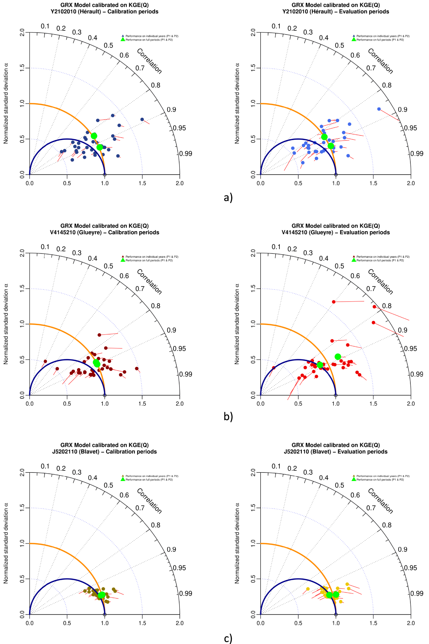
4.3. Impact of square root transformation on multi-objective assessment of model performances
We now present a numerical experiment performed on a limited sample of 635 watersheds (randomly selected). GRX and MRX models were calibrated using a classical mathematical transformation, i.e. square root (RQ) applied to streamflow, using NSE(Q & RQ) and KGE(Q & RQ) as objective functions. This transformation is classically used to better represent a larger range of streamflows (i.e. low-flows) and reduce the weight of high-flows during calibration [Pushpalatha et al. 2012]. Another transformation has been tested (log transformation), but results are not shown due to documented numerical issues of this transformation [Santos et al. 2018].
Figure 9 presents Taylor diagrams with GRX model performance in calibration and evaluation for NSE(Q) (a) and NSE(RQ) (b). Figure 10 presents Taylor diagrams with GRX model performance in calibration and evaluation for KGE(Q) (a) and KGE(RQ) (b). Similar results for MRX are shown in Appendix A, Figures A5 and A6.
Taylor diagram representing variability bias and correlation (points) and mean bias (red arrows) for GRX model in calibration (left) and evaluation (right), when calibrated with (a) NSE(Q) and (b) NSE(RQ) as objective function. The contour plot illustrates the two-dimensional density of points (from 10% to 90% of the sample).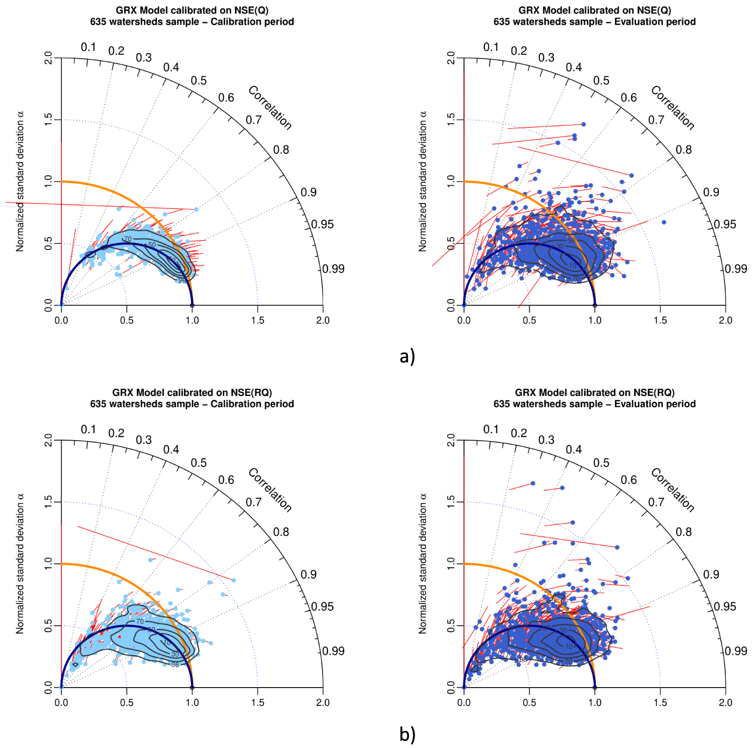
Taylor diagram representing variability bias and correlation (points) and mean bias (red arrows) for GRX model in calibration (left) and evaluation (right), while calibrated with (a) KGE(Q) and (b) KGE(RQ) as objective function. The contour plot illustrates the two-dimensional density of points (from 10% to 90% of the sample).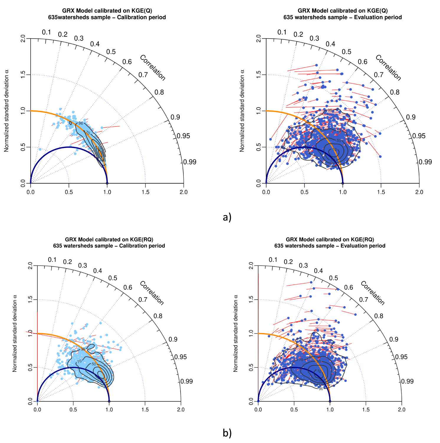
When using the NSE metric as objective function for parameter optimization, in calibration, Figure 9b left (square root transformation) compared to Figure 9a left (natural streamflow) shows that this classical numerical transformation of streamflow increases the normalized standard deviation bias, with a majority of points located slightly to significantly under the blue semi-circle line with an increasing spread, for square root transformation of streamflow. Two-dimension contour plots surface of 90% of the population increase from NSE(Q) to NSE(RQ). In evaluation, Figure 9b right (square root transformation), compared to Figure 9a right (natural streamflow) shows that the pattern found in calibration remain the same concerning the normalized standard deviation bias, with an increase of the spread of the results (as shown by the two-dimensional contour plots surface of 90% of the population).
When using the KGE metric as objective function for parameter optimization, in calibration, Figure 10b left (square root transformation) compared to Figure 10a left (natural streamflow) shows that this classical numerical transformation of streamflow increases the normalized standard deviation bias, with a majority of points located between the red semi-circle line and the blue semi-circle line for square root transformation. The spread of the results increases slightly for square root transformation. Two-dimension contour plots surface of 90% of the population increases from KGE(Q) to KGE(RQ). In evaluation, Figure 10b right (square root transformation) compared to Figure 10a right (natural streamflow) shows that the pattern found in calibration remain the same concerning the normalized standard deviation bias, with an increase of the spread of the results (as shown by the two-dimensional contour plots surface of 90% of the population).
Comparison of Figure 9a (calibration with NSE(Q)), Figure 10a (calibration on KGE(Q)) and Figure 10b (calibration on KGE(RQ)) allows to compare patterns of results (in calibration and evaluation) for different objective functions. Concerning the variability bias, this comparison shows that pattern of calibration with KGE(RQ) lies in-between patterns of KGE(Q) (no bias) and NSE(Q) (𝛼 = R).
5. Discussion
Based on a worldwide sample of 2050 watersheds, two conceptual rainfall-runoff models (GRX and MRX), two metrics classically used in hydrology (Nash–Sutcliffe efficiency and Kling–Gupta efficiency) and a split sample test, this paper investigated the usefulness of a modified Taylor diagram to analyze the results of large sample experiments.
We first proposed a modified Taylor diagram to make clear the theoretical reasons why OLS schemes tend to bias model simulations towards an underestimated standard deviation of streamflows. Empirical evidence of this behavior was provided in an intensive numerical experiment over a large watershed sample. NSE(Q) is still largely used by hydrological modelers and we encourage the use of KGE(Q) instead of NSE(Q). The clear advantage of KGE(Q) instead of NSE(Q) is that it deals with the optimization process involving several objective functions (correlation, ratio of means, and ratio of standard deviations) independently while NSE(Q) implicitly involved a prescribed trade-off between correlation and ratio of standard deviation. As a consequence, we showed that calibrating hydrological models with NSE(Q) led to significant variability biases on watersheds where models have difficulties representing the temporal behavior of the watershed. KGE(Q) tended to reduce long-term mean and variability bias, independently from the models’ level of correlation. These problems related to NSE (and more generally to OLS schemes) were already reported in previous studies [see e.g. Gupta et al. 2009] but the illustration provided by the modified Taylor diagram is a valuable add-on to these studies. Besides these numerical problems, NSE does put more weight on high flows, in the sense that high flow days have a major contribution to the total squared error. As with all least-squares-based schemes, using NSE implicitly considers uncorrelated error time series and homoscedastic errors [see e.g. Kavetski et al. 2003] and thus does not use the whole information concerning the temporal structure of the observed discharge time series. KGE allows to partially cope with this problem by including more explicitly the errors in variance. Other smarter error models (e.g. weighted least square accounting for heteroscedasticity or correlation in the residuals) may be considered and visualizing their optimization results under the proposed Taylor diagram may help to understand how the trade-off between correlation, the ratio of means, and the ratio of standard deviation are modified compared to NSE(Q) or KGE(Q).
Interestingly, we showed that the biased optimization of OLS schemes towards reduced streamflow variability was independent on the model used and the environmental settings of the watersheds. When modeling a single watershed, modified Taylor diagrams can be represented for all hydrological years individually since the use of full-period aggregate performance metrics may not provide sufficient discrimination to properly assess model behavior on sub-periods. Figure 8 showed that the optimization process may be different according to the studied watershed in the way it deals with annual biases and compensation along the calibration period. Thus, we believe that the modified Taylor diagram can be an interesting tool to investigate the ability of the model to reproduce individual years, in complement to other existing graphical tools [see e.g. Coron et al. 2015]. This diagnosis allows the modelers to figure out the ability of the model for extrapolation.
Last, we showed that calibrating hydrological models with NSE metric applied to square root of streamflows increases the initial pitfalls of using the NSE metric on natural streamflow. This transformation increases the normalized standard deviation bias of simulations while increasing the spread of the results in the (R, 𝛼) space. It is also shown that calibrating hydrological models with KGE metric applied to the square root of streamflow reduces the benefits of using the KGE metric on streamflow. Again, this transformation increases the normalized standard deviation bias of simulations, while increasing the spread of the results in the (R, 𝛼) space. As stated before [Santos et al. 2018], we consider that using KGE metric on square root has significant drawbacks and should be avoided since the main drawbacks of the NSE metric are introduced again.
6. Conclusion
We proposed in this paper a novel diagnostic tool for hydrological model simulations. The proposed graphical tool is based on the Taylor diagram and we adapted this diagram to visualize commonly used assessment criteria in hydrological modeling.
The adapted Taylor diagram illustrates some well-known drawbacks of OLS schemes widely used in the scientific community and particularly the fact that the standard deviation of the simulated streamflow is systematically underestimated. While the use of alternative objective functions such as the KGE(Q) overcomes these problems, future works may investigate the outputs of hydrological models optimized with other objective functions that consider heteroscedasticity and/or based on flow signatures. Representing the outputs of these more complex objective functions into the modified Taylor diagram may help to understand how the calibration process deals with the trade-off between correlation, the ratio of standard deviation, and the ratio of means.
Conflicts of interest
Authors have no conflict of interest to declare.
Acknowledgements
Authors would like to thank Charles Perrin for his valuable support and constructive comments on the manuscript. Authors would like to warmly acknowledge Editors for their invitation to contribute to this special issue and the three anonymous reviewers for their very constructive remarks.
Authors acknowledge: Météo France, SCHAPI-Banque Hydro, EDF, Laurent Coron, Nicolas Le Moine and Audrey Valery for the French data sets, Jai Vaze and Francis Chiew for the Australian data sets (CSIRO), John Schaake and Qingyun Duan for the American (MOPEX) data set, Audrey Valery for the Swiss (Météo Suisse and OFEV) and Swedish (SMHI) data sets, Berit Arheimer for the Swedish (SMHI) data sets, and Barry Croke and Ian Littlewood for the English data sets (TDMWG).
Codes used to produce Taylor diagrams of this paper will be made available in the airGR package [Coron et al. 2017, 2022].
Appendix A.
Appendix A shows the results for MRX model of numerical experiments:
Taylor diagram representing variability bias and correlation (points) and mean bias (arrows in red) for (a) MRX model in calibration (left) and evaluation (right) while calibrated with NSE(Q) as objective function, and (b) MRX model in calibration (left) and evaluation (right), when calibrated with KGE(Q) as objective function. Contour plots illustrate the two-dimensional density of points (from 10% to 90% of the sample).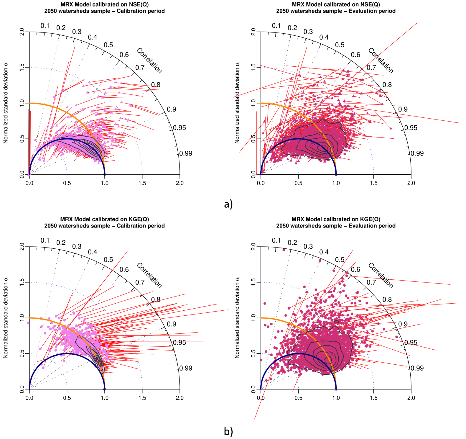
Taylor diagram representing variability bias and correlation (points) and mean bias (red arrows) for MRX model in calibration (left) and evaluation (right) for (a) arid with desert and steppe cluster (586 watersheds), (b) temperate with warm summer cluster (785 watersheds) and (c) temperate without dry season and warm summer (125 watersheds), when calibrated with NSE(Q) as objective function. Contour plots illustrate the two-dimensional density of points (from 10% to 90% of the sample).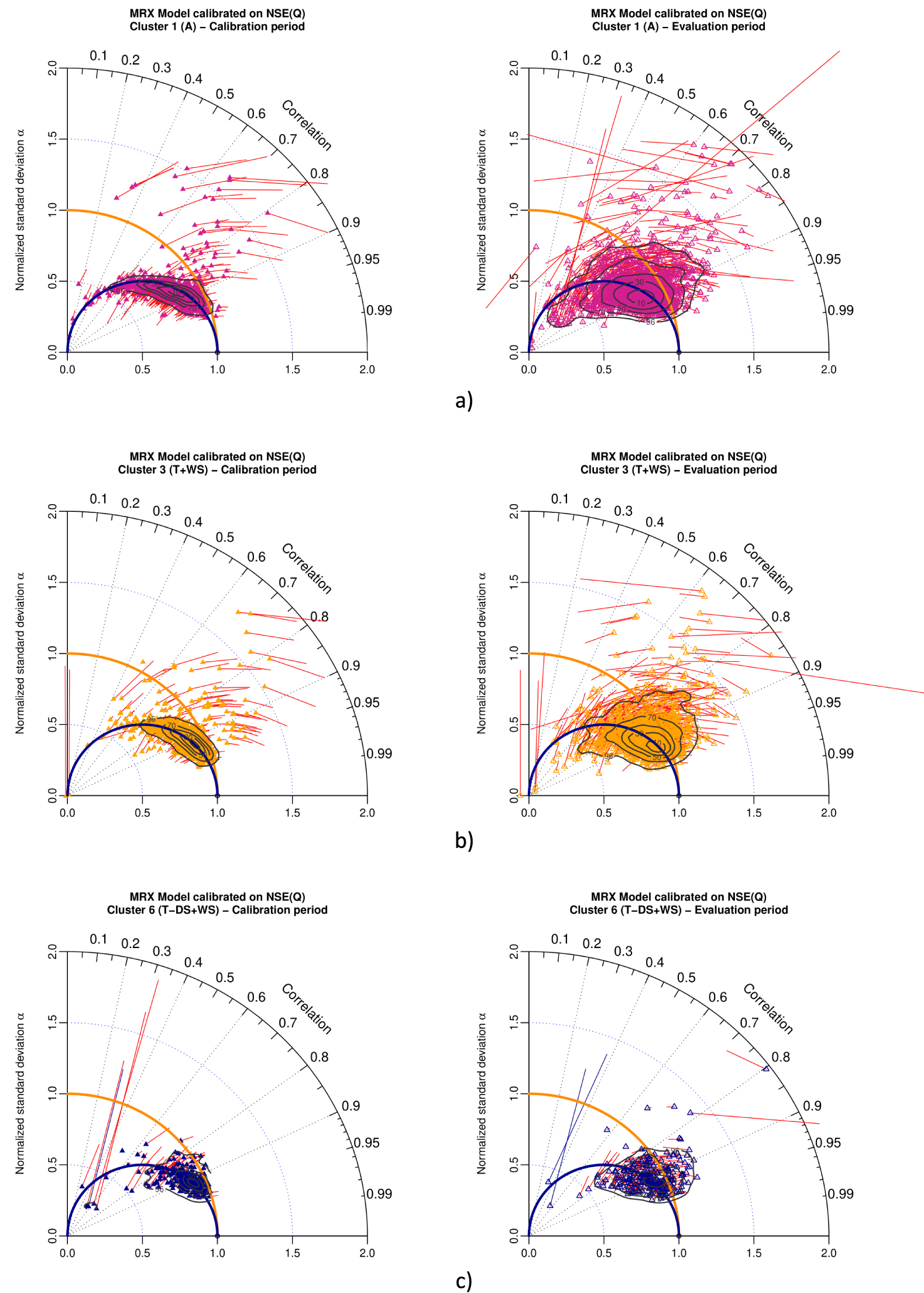
Taylor diagram representing variability bias and correlation (points) and mean bias (red arrows) for MRX model in calibration (left) and evaluation (right) for (a) arid with desert and steppe cluster (586 watersheds), (b) temperate with warm summer cluster (785 watersheds) and (c) temperate without dry season and warm summer (125 watersheds), when calibrated with KGE(Q) as objective function. Contour plots illustrate the two-dimensional density of points (from 10% to 90% of the sample).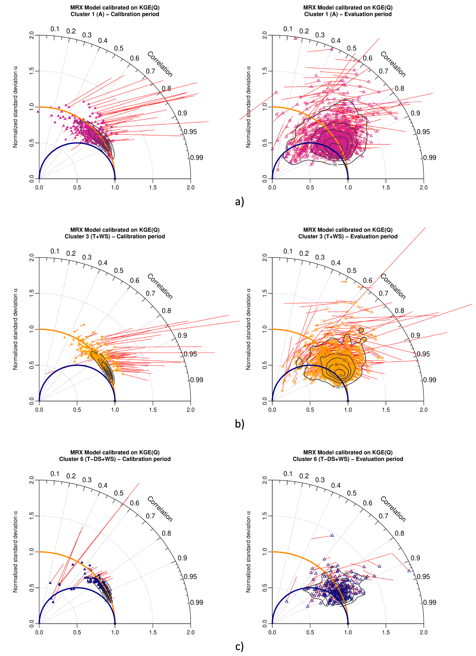
Taylor diagram representing mean bias, variability bias and correlation for MRX model in calibration (left) and evaluation (right) for (a) Hérault watershed, (b) Glueyre watershed and (c) Blavet watershed, while calibrated with KGE(Q) as objective function. Points either represent performances on individual years (color) or on the full periods (green color). These three watersheds had been selected because generations of Ghislain de Marsily and Pierre Hubert students (DEA National d’Hydrologie) swan, practiced kayak or celebrate New socio-hydrological years (NASH) in their beautiful waters.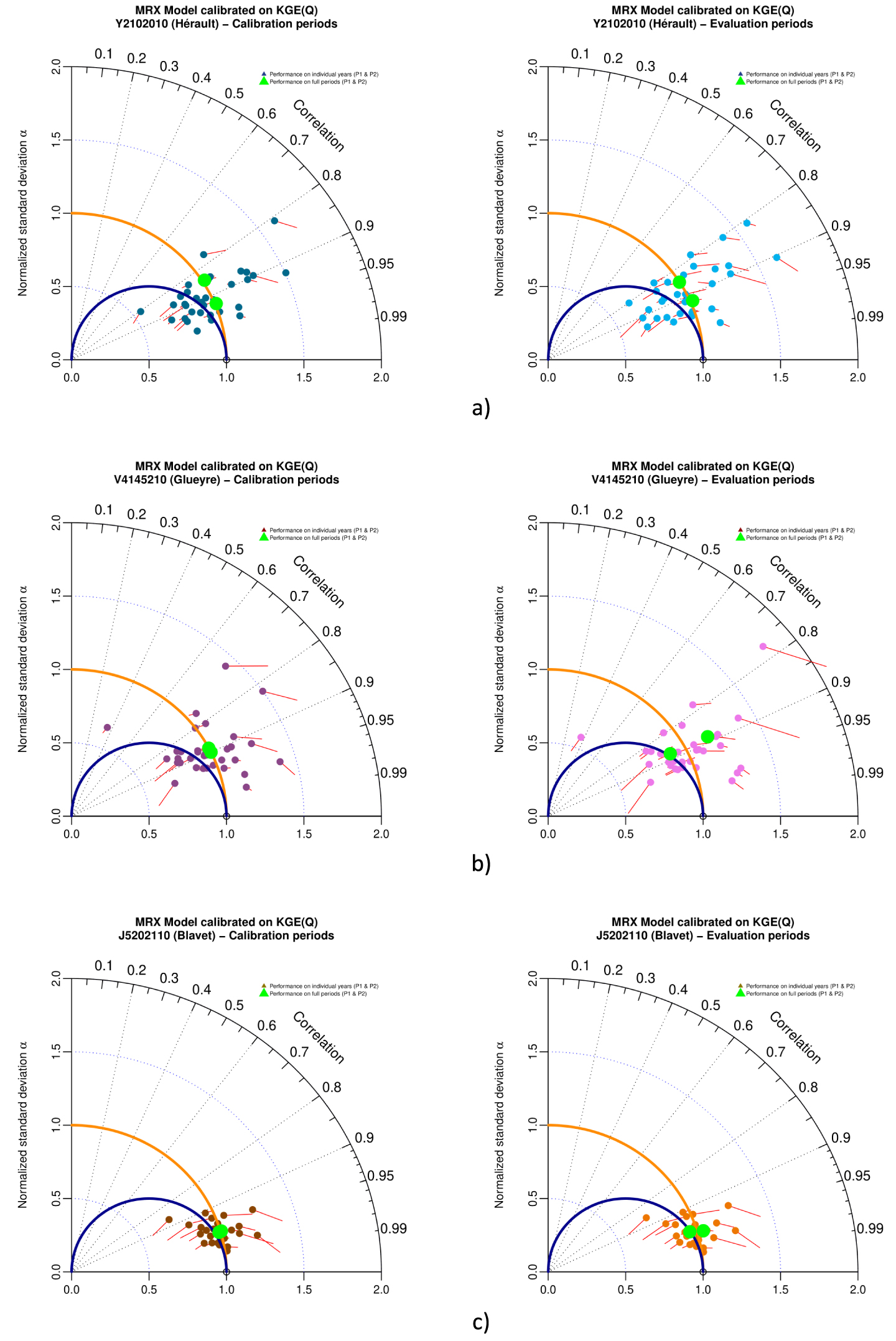
Taylor diagram representing variability bias and correlation (points) and mean bias (red arrows) for MRX model in calibration (left) and evaluation (right), when calibrated with (a) NSE(Q) and (b) NSE(RQ) as objective function. The contour plot illustrates the two-dimensional density of points (from 10% to 90% of the sample).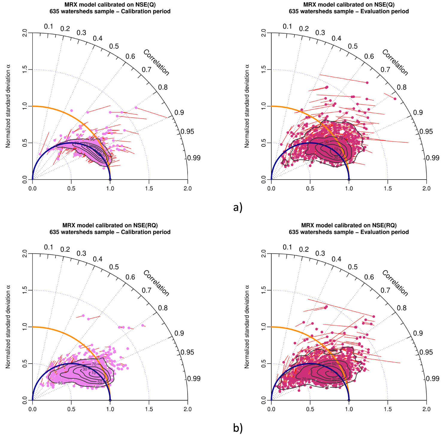
Taylor diagram representing variability bias and correlation (points) and mean bias (red arrows) for MRX model in calibration (left) and evaluation (right), when calibrated with (a) KGE(Q) and (b) KGE(RQ) as objective function. The contour plot illustrates the two-dimensional density of points (from 10% to 90% of the sample).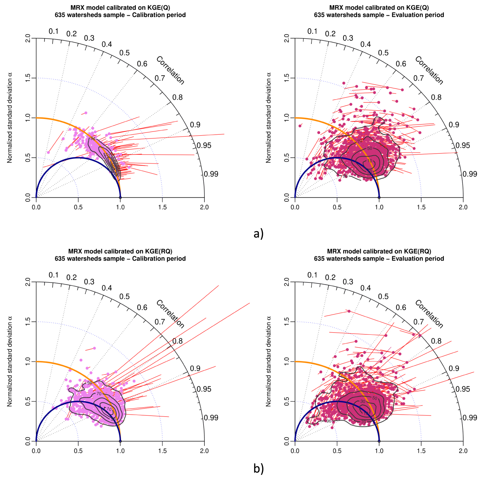
- Figure A1 (corresponding to Figure 11 for GRX): Taylor diagram for calibration with NSE(Q) and MSE(Q);
- Figure A2 (corresponding to Figure 12 for GRX): Taylor diagram for calibration with NSE(Q) for 3 different climate clusters;
- Figure A3 (corresponding to Figure 13 for GRX): Taylor diagram for calibration with KGE(Q) for 3 different climate clusters;
- Figure A4 (corresponding to Figure 14 for GRX): Taylor diagram for calibration with KGE(Q) for 3 different watersheds in France (Hérault, Glueyre and Blavet);
- Figure A5 (corresponding to Figure 15 for GRX): Taylor diagram for calibration with NSE(Q) and NSE(RQ);
- Figure A6 (corresponding to Figure 16 for GRX): Taylor diagram for calibration with KGE(Q) and KGE(RQ).
These figures show that numerical experiments with MRX model lead to similar results and conclusions to those obtained with GRX model (patterns on Taylor diagrams are very similar). These analyses with GRX and MRX models confirm the generality of our results, independent from the rainfall-runoff model structure.


 CC-BY 4.0